My client brief is to produce a logo design, ticket design and make an advertising poster for a Fruit and Veg festival in Cambridge. Throughout my project I have been progressing to my design ideas which will hold my ideas and thoughts on where I would like to go with this project. These design ideas have come from my photos and my observational drawings, I have used my observational drawings as a stepping stone towards my designs. For example I have been documenting what I believe the advantages and disadvantages of each piece that I have created to put together a structure to create my logo designs. I have also been taking my own photographs of fruit and vegetables, which show a big variety of colour and shape that I will be using in my final designs.
The artists and designers that have influenced me have been the logo designers I have looked at in the later stage of the project, these have put an effect on me and a way of which I will like my own logo to turn out. In my design ideas I have been focusing on the way logos use shape and colour to show their ideas and messages to the viewer. My favorite logo out of these two ideas is the Smooth Festival logo, I like this because of the simple font to go with the technical colour ways, this is what I would like to communicate in my own.
The colours I would like to use will be the ones shown in the images I will be working with, I will then open the image up in Photoshop and pixelate it to display the colours in a simple box. I will then put that on illustrator with my designs and use the colour picker to add these colours onto my designs. Then I can create the perfect combination for my piece. The brilliant thing about doing this is that I may change one colour, but that will change how all of the colours come across.
The fruit that I will be focusing on for my logo design will be strawberries. The main piece the I will be taking most of my information about shapes and colours will be the line drawing that I created and also the image the I took. This I feel will help me create the natural shapes of the strawberry and not making it look too staged and perfect. This will then also make the logo more exciting and visually pleasing the the viewer.
Tuesday, 25 March 2014

Thursday, 13 March 2014
Adrian Knopik
Smooth festival is a modern music festival with stars like Macy Gray, Chambao, Maria Mena, Lura together with Polish artists. We prepared complete key visual for Smooth Festival, which took place in Poland in May 2009. The agency (Darkstone & Cardinal) was responsible for creating logo, billboards, posters and press advertisements. The festival itself was held for the first time in Poland and immediately became a big success.
Adrian Knopik has used Photoshop and illustrator to create this festival logo design. He has used these because of the colours that you can mix and the technique, which can only work on illustrator. Also on Illustrator, if you keep it on there the work will be vectored so that the printing company can print the work out at a large size for posters and other important advertising and still keep the same crispness, however with Photoshop this theory does not work as the work is created with pixels, the same as in a photograph.
The artwork consists of three distorted triangles with smooth sides layered on top of each other; it then has two small single distorted circles with one solid colour. The logo then has typography over the top, which is a solid white colour, the ‘SMOOTH’ writing is in bold so that this is the piece of writing that the viewer first sees and then the eye is drawn down to the festival which was in the same font and italic however this was not in bold.
The colours used have been layered over the top of each other to create other colours. The first main colours were pink, yellow and blue and the he put them on top of each other to make different colour ways.
I feel that I thing that makes this piece so successful as a logo design is the way the the shapes are so simple to create an overlay which brings free shapes together to form one unique piece. I also really like the way that they have used this new technique that I have never seen before. This technique is using three main colours and then layering them up so that the colours shine through eachother to create lots of new colours. For example the yellow and the green together make the blue. In my own work I would like to communicate my logo through using colour and shapes and I think this a really good example of showing this.
Personally I feel that the festival title and the logo are in sync with each other and work really well, I think this because of the font used. In my transcription I have used PT Sans because I believe this was the closest font I could find and match up with the original. The designer has kept this title simple so its bold, however does not attract away from the logo colours and design and I would really like to add something like this into my own work and the design will defiantly have a strong influence on it.
Original Logo:

My Transcription:

http://www.behance.net/RARRFC
Tuesday, 11 March 2014
Market Research
In order to investigate further into my logo designs I believe I need to identify my target audience and see who will be viewing my piece so that I can make it fit into this age group as well as possible.


Above is the information I feel I need for my logo design ideas, I think this because it gives me a true amount of the population in cambridge and also gives me a sense of what types of people might be passing by or deciding to buy a ticket. In Cambridge there are 14 wards which are shown above, Parkers Piece is in the Market, the market area in Cambridge is not the most populated however it's in the middle of all of them so that it holds a strong impact on the population and it will be important for me to create my logo design using these statistics.
My Target Audience
Location
- Cambridge Parkers Piece
People in the area
- Students
- Academics
- Tourists
- Visitors
- Local people
I am basing my facts and figures of the age and area population from the Cambridge City Council website and sourced for Research Group Cambridgeshire county Council - 2011…
Above is the information I feel I need for my logo design ideas, I think this because it gives me a true amount of the population in cambridge and also gives me a sense of what types of people might be passing by or deciding to buy a ticket. In Cambridge there are 14 wards which are shown above, Parkers Piece is in the Market, the market area in Cambridge is not the most populated however it's in the middle of all of them so that it holds a strong impact on the population and it will be important for me to create my logo design using these statistics.
My Target Audience
- 25-44
- I believe that this is the best possible target audience to use for my logo design, as this will be the age group that will most likely be going to the festival.
Health and Safety
Health and Safety at work Act 1974
Step 1 - Identify the hazard


- The Health and Safety (First-Aid) Regulations 1981 (Re-interpreted in 1997)
- The Management of Health and Safety at work regulations 1999 (The Management Regs)
- The Provision and Use of Work Equipment regulations 1998 (Puwer)
- The Personal Protective Equipment Regulations 1992 (PPE Regs)
- The Control of Substances Hazardous to Health Regulations 2002 (COSHH Regs).
Step 1 - Identify the hazard
- Look
- Check instructions
- Check COSHH
- How severe could and injury be?
- What is the likelihood of any injury occurring? (Probability)
- Multiply the two figures to get a Risk Value
- Decide on precautions, can I get rid of the hazard altogether?
- If No:
- Try a less risky option, different chemical
- Prevent access
- Reduce exposure
- P.P.E
- Provide welfare facillities e.g Hand washing/ First aid
Step 4 - Record findings
Step 5 - Review and update risk assessments as necessary
COSHH ACT
- COSHH is the law that requires employers to control substances that are hazardous to health. You can prevent or reduce workers exposure to hazardous substances by:
- Finding out what the health hazards are
- Deciding how to prevent harm to health (risk assessments)
- Providing control measures to reduce harm to health
- Making sure they are used
- Keeping all control measures in good working order
- Providing information, instruction and training for employees and others
- Providing monitoring and health surveillance in appropriate cases
- Planning for emergencies
Most businesses use substances, or products that are mixtures of substances. Some processes create substances. These could cause harm to employees, contractors and other people. Sometimes substances are easily recognized as harmful. Common substances such as paint, bleach or dust from natural materials may also be harmful.
Friday, 7 March 2014
Logo Research
Below are some logo designs I have sourced off the internet, I am using these for research leading up to my own logo design. I wanted to look at the way logo designs are created in the real world and how I can create my own to fit in with the trends at the moment to draw people towards my festival.

I feel that this logo has some of the qualities that I would like to see in my own design, the font plays the key role as it has been created to have a clean finish which makes the company more appealing.

I really like this piece because of the strong outlines outside of the shapes, this then shows what shapes the text is in and also makes it easier to read the words that are most important. I also really like the colours used as they all contrast each other well. Also this logo design is celebrating the 26th year of running the Hanover Beer Festival, in order to fit the logo with this occasion they have used old text and backgrounds and also the colours used are old and dark to link in with the theme.
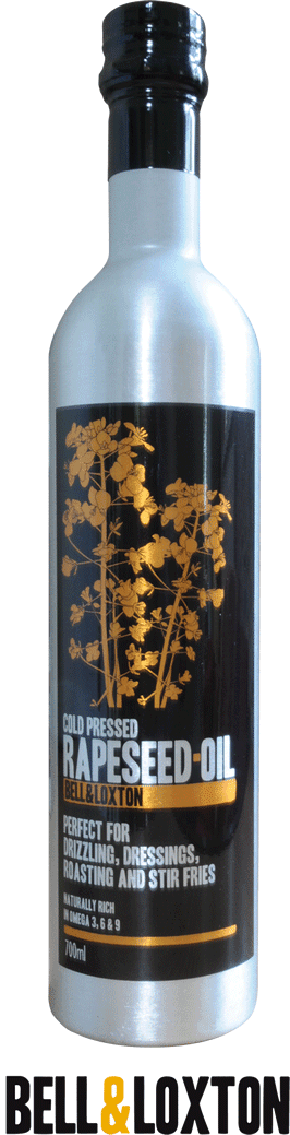
Here is a logo design that is on a cooking oil bottle. I feel that is design flows really well, i believe this because I think when the customer looks at the product the firstly look at the top and then their eyes are drawn down, the gold tree on the black background helps this a lot and makes it easier for the customer to get the important information and take it in. I feel that for my own posters and tickets I will have to take this into consideration.

This logo shows the way that you can communicate your logo design in big powerful letters as shown on this piece. I also think that the letters are so bright and bold because of the small white outline and the overlapping of the letters.

To the left is a funfair logo, this piece is the closest to my festival brief as it is an event where people visit and there is possibility of a ticket design to go with this logo, I think this is successful because of the colours used and the way they have used their target audience for the funfair of the younger ages to impact on the bright colours of the logo.
I feel that this logo has some of the qualities that I would like to see in my own design, the font plays the key role as it has been created to have a clean finish which makes the company more appealing.
I really like this piece because of the strong outlines outside of the shapes, this then shows what shapes the text is in and also makes it easier to read the words that are most important. I also really like the colours used as they all contrast each other well. Also this logo design is celebrating the 26th year of running the Hanover Beer Festival, in order to fit the logo with this occasion they have used old text and backgrounds and also the colours used are old and dark to link in with the theme.
Here is a logo design that is on a cooking oil bottle. I feel that is design flows really well, i believe this because I think when the customer looks at the product the firstly look at the top and then their eyes are drawn down, the gold tree on the black background helps this a lot and makes it easier for the customer to get the important information and take it in. I feel that for my own posters and tickets I will have to take this into consideration.
This logo shows the way that you can communicate your logo design in big powerful letters as shown on this piece. I also think that the letters are so bright and bold because of the small white outline and the overlapping of the letters.
To the left is a funfair logo, this piece is the closest to my festival brief as it is an event where people visit and there is possibility of a ticket design to go with this logo, I think this is successful because of the colours used and the way they have used their target audience for the funfair of the younger ages to impact on the bright colours of the logo.
Thursday, 27 February 2014
Project Review
My client brief is to create logo design, ticket design and advertising posters for a Cambridge Fruit and Vegetable festival, which is taking place on Parkers Piece Cambridge. The subject matter and content for my client brief will be the fruit and vegetables, as I will be taking pictures of only the interesting fruit where I will then be creating different manipulations from observational drawings and also creating pieces straight off the computer, for example logo designs and ticket designs.
The developmental work that is required to go forward with my project and designs is that I need to explore more artists that relate more to my work and the pieces I would like to produce. So that then I can gain influence and inspiration for my own logo designs.
I believe that my strengths for my final major work are my practical pieces and specialist techniques, as I believe that I am good at looking and analyzing artist work by finding out the true reason behind the work. Then I use the techniques that I have learnt from the artist and put this into my own work. A good example from this is the artist Michael English that I analysed. This helped me discover the way that colours play a big part in art, as then I went onto creating my Photoshop pieces focusing on colour which was a success.
My opportunities for my project are to explore new ways of experimenting with logo design on illustrator and looking at new ways to produce what I want and make it look professional. My weaknesses are my imagery, I need to take more images of a variety of fruit and veg and also i need to zoom in more to the detailed areas tat make them so unique and interesting.
I would like to focus on a few main things to create a good logo design, as I feel if I focus on the shapes and colours I can create a simple logo the will grab the viewers attention which is exactly what I would like to communicate.
The developmental work that is required to go forward with my project and designs is that I need to explore more artists that relate more to my work and the pieces I would like to produce. So that then I can gain influence and inspiration for my own logo designs.
I believe that my strengths for my final major work are my practical pieces and specialist techniques, as I believe that I am good at looking and analyzing artist work by finding out the true reason behind the work. Then I use the techniques that I have learnt from the artist and put this into my own work. A good example from this is the artist Michael English that I analysed. This helped me discover the way that colours play a big part in art, as then I went onto creating my Photoshop pieces focusing on colour which was a success.
My opportunities for my project are to explore new ways of experimenting with logo design on illustrator and looking at new ways to produce what I want and make it look professional. My weaknesses are my imagery, I need to take more images of a variety of fruit and veg and also i need to zoom in more to the detailed areas tat make them so unique and interesting.
I would like to focus on a few main things to create a good logo design, as I feel if I focus on the shapes and colours I can create a simple logo the will grab the viewers attention which is exactly what I would like to communicate.
Friday, 21 February 2014
Gallery Visit - Taylor Wessing
The Taylor Wessing Photographic Portrait Prize 2013is a
unique opportunity to see sixty new portraits by some of the most exciting contemporary photographers from around the world.
Through editorial, advertising and fine art prints, the exhibition explores a range of themes, styles and approaches to the photographic portrait, from formal commissioned
images of famous faces to more spontaneous and intimate
moments capturing friends and family.
The gallery has four main prizes for the photography work that has been submitted into the National Portrait Gallery, below is an image of the first prize winner by Spencer Murphy Called Katie Walsh. And below that is a picture of all the top four photographs.
unique opportunity to see sixty new portraits by some of the most exciting contemporary photographers from around the world.
Through editorial, advertising and fine art prints, the exhibition explores a range of themes, styles and approaches to the photographic portrait, from formal commissioned
images of famous faces to more spontaneous and intimate
moments capturing friends and family.
The gallery has four main prizes for the photography work that has been submitted into the National Portrait Gallery, below is an image of the first prize winner by Spencer Murphy Called Katie Walsh. And below that is a picture of all the top four photographs.


As I walked past the ticket man I was smacked with the first amazing photography which was a large A1 piece, as this was my first time at the taylor wessing prize event, the atmosphere was clean and basic with great big pieces on the wall surrounding me, I didn't know where to look first.
The first prize was awarded to Spencer Murphy for his interesting piece of the jokey rider called Katie Walsh.The 35-year-old grew up in Kent and studied at the Kent Institute of Art and Design before getting a BA in photography at Falmouth College of Arts. I have chosen this image because it is the most important photograph in the room as it got 1st prize. The most important thing and the most impressive thing that makes this image so incredible is the detail that has been captured with the digital camera. There photographer has used this technique with using a normal shutter speed shows the detail and makes the picture look motionless.
I believe that the environment that this photograph has been taken in was just after a race, as after a jokey race the rider has a lot of emotion on how the race has gone and how they have performed. I believe that this is a really good time to take the image as you can get a lot of emotion in the image and it can mean a lot more than a staged photo shoot.
Also I feel the the dirt of her face and clothes make the piece so alive because of the way that it shows a realistic feel to the piece and the way it feels like she has just got off the horse.
I feel that this gallery has a very good atmosphere and has so great photograph and the best in the country, I also feel that it is a great gallery to visit because if you are an artist like myself you can get useful ideas on the photographs and also add some of the ideas into your own work and outcomes.
Although this is photography and I am doing graphic design for my final piece I still feel that I can take something away with me to my own work. I believe that this piece by Spencer Murphy has shown true emotion well and built up an image that shows the true picture. In order to do this in my own work I think I will need to work with shapes because I want the viewer to know what shape I am showing however still have that interesting part to it and make it something that you cant stop looking at.
Subscribe to:
Posts (Atom)